Friday, 26 October 2012

This is the Maaaaaask!


What comes to your mine when the word ‘mask’ comes up? For me it’s something that hides your identity and makes up an entire different one for other people to see. Truthfully, I wholeheartedly agree that everyone wears a mask for different types of people. From relatives to friends to associates to just anyone, definitely we have this inner part in our self that we want to conceal and kept hidden, sometimes disguise.
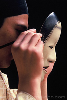
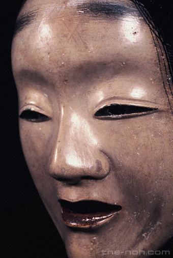
能面「白曲見」 http://www.the-noh.com/en/world/img/mask01.jpg

When it comes to art however mask is a whole another level. It varies from different cultures. Let’s say for instance the Japanese, their idea of a mask, particularly the ‘Noh’ masks are mainly worn by men throughout a long performance. There are five categories of Noh masks: Gods, Men, Women, the Elderly and the Devil. As it is often difficult to tell the actual feelings expressed in a Noh mask, it is said to be made with a “neutral” expression.

Another mask that I find to be interesting is the Venetian Mask aka Masquerade Mask. Its long history states that its role is to protect the wearer’s social standing identity during promiscuous activities. It was made for centuries in Venice. The materials used was paper-mache and wildly decorated with fur, fabric, gems, or feathers. Additionally, the masks served an important social purpose of keeping every citizen on an equal playing field. For example if servant would have worn a mask, he or she could be mistaken for a nobleman—or vice versa.


Those are just some research I did for mask that made an impression on me but there are TONS of other mask that never fail to shock me. Here I’m gonna share a few :)

 
Minimalist Mask (Star Wars)

Minimalist Mask (Iron Man)

Quilling Inspired Mask

Origami Inspired Mask

Origami Inspired Mask


Laces are added to the Mask

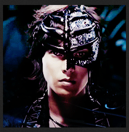
Reminded me of the Phantom of the Opera

 And behold, I have made a mask of my own :)  The theme for is as you can see, fire! The right side of the mask resembles a firefox tail. 

Friday, 19 October 2012

STEAM PUNK

 When all of of us were assigned to do a sketch based on steam punk, I had trouble on what to do because I had so idea what steam punk really is. So the first thing I had done when I reached home, immediately search on films based from it.

 
Lucky for me, being a Hayao Miyazaki fan, one of his animated films had a steam punk theme. The film was called, 'Howl's Moving Castle' just in case you haven't watch, I Highly recommend that you do. It honestly is interesting how he puts these elements into the film. Not only are the designs spectacular but how he managed to make the film worked!

 
As far as I know, it comes from the Victorian era, but include advanced machines based on 19th century technology and somehow supernatural as well. I would also say that it takes a whole new world all together. I bet you would agree to this because Steampunk is a genre and a design aesthetic don't you say?

 
What I notice about Steam Punk is, mostly it involves a lot of gears, mix with a somehow a futuristic twist. Kinda robotic whimsical if you say. Oh and of course, machinery! I would say, cyber punk. It doesn't just end there, the buildings, fashion, culture, art everything is astonishing. You could even sense somehow a dark sorrow aura in it, almost goth.Various modern utilitarian objects have been modded by individual artisans into a pseudo-Victorian mechanical Steampunk style.

Here are more devices and things inspired from Steampunk


Dagmar’s “Steam Amp”
Steampunk inspired Cake!


http://24.media.tumblr.com/tumblr_md8423itVm1qfzxa7o1_1280.jpg
Hotair Airlines by Ito-Saith-Webb

Oh and enjoy some steampunk inspired music video :)


Behold, this is my interpretation of steampunk with a certain style to it. So basically the concept is a pathway of virtual reality, you can see (hopefully you can) I've drawn a somehow giant pointy gears which is actually a vortex. The top part of the right side globe is the projector that projects the vortex. The bridge right there well, it's the pathway towards the vortex :D How I got the inspirations? Well from the research above and unexpectedly Thor. I like the outcome of this since it's kinda abstract yet machine-y.

Thursday, 11 October 2012

To Cut or not to Cut

I’m talking about paper that is. The next task was to make several pieces of paper cut artworks and stick in on a mounting board, I chose to choose the black since for me it more eye catching and cool. Plus white dirties easily. The theme for this paper cutting assignment for me is minimalist. As soon as you see the art works, you'll know what the images that are formed.

Asymmetrical Balance
Basically it’s like balancing element with another element. It has to change its position or rotate it.

                                                                               
Symmetrical Balance
This is on the other hand is making the opposite colours of the artwork. It’s like you negative-it.

Hierarchy
Plain and simple. The order has to have a value so it fits the position

Movement
Cute isn’t it. I chose to make like the fish are moving upwards and ‘meets’ the ship and at the end you could see the clouds. It makes your eyes go to the direction of the image.

Scale
From big to small.  Candles everywhere!

Repetition:
One Four word; Repeat, repeat and repeat! I make a repetition of shirts and you can see crowns hiding :D

Dominant
Your eyes are to focus on one spot. This particular is the heart in the middle. Inspired by one of my childhood cartoons; The Powerpuff Girls!

Rhythm
The movement of the artwork. I'd like to portray that the paint brush are dancing and ‘having fun’ along with the 'rhythm'

Overall, I’m happy with the pieces, especially the Symmetrical Balance since I was inspired by a favourite character of mine. It turned out well!

Wednesday, 10 October 2012

INTRO TO GESTALT

 Most of you by know would know what Gestalt Principle is, but do you really understand what role it plays? 

 
Let me start with Figure Ground. Basically it talks about when our eyes differentiate an object form from it's surrounding area; a form, silhouette or shape is naturally perceived as figure(object), while the surrounding area is perceived as ground (background) When two fields have a common border, our visual system will interpret the image as two different perceptions, A figure is what we look at and a ground is everything else that forms the background.

 
Closure on the other the other hand, occurs when an object is incomplete a space is not completely enclosed although when a certain object is not complete, it is enough for the eye to complete the shape. When the viewers perception completes a shape, closure occurs. See how the text up there actually forms a glass?

http://jour273.files.wordpress.com/2012/09/gasmaskandsmoke-gestalt-final12.jpg 
Proximity is simple and straightforward. It happens when elements are places close together, they tend to perceived as a group!

 
You could say Similarity is also perceived as a group/pattern. It occurs when 1 object looks similar to one another. Sometimes similarity can also be categorized as proximity.

 
Continuity happens when the eye is compelled to move through one object and continue to another object. Viewers see elements that form a smooth continuation.

 
Lastly (fuh) Alignment! Basically lining up objects to form groups :D Such shapes can make a a difference like what you see up there. The triangles form some sort of a mountain.

Tuned in for for since there's quite a number of projects that relate to this principle. One of them is a group video and the other one is Tessellation (which I'm guessing will take a while)