Thursday, 29 November 2012

TESSELLATIONS

We were given the task to do 6 types of Tessellation. It was quite a challenge for me because I am not really an expert at making them. At first I had to admit because of time constraint I wondered how on earth can I finish this on an A2 size paper. But despite the difficulties, I managed to produce 6 very different types of Tessellation.

Tessellation goes back from M.C. Escher and William Morris. By seeing his artwork, I was inspired to do different types of patterns. I have to say, it did provoke my art sense in way that yes, art involves some mathematical thinking. Through Tessellation, we have to calculate how those pieces fit together to form an image. I won’t say it’s an easy task because it actually takes time to make sure it’s perfect.

The first one is Figure Ground:
Here is an image of waves. The pattern is quite simple and the colours make it obvious to tell that it’s waves

The second one is Closure
I chose to make a side profile of a face to show some sort of a closure pattern.

Third is Proximity


Could you guess what the image forms? If it wheels then you guessed it correctly! Proximity is basically images that goes from big to small or vice versa

Fourth is Similarity
Simple and quick. Similarity could also be related to repetition as the patterns are quick similar. Here I have a honeycomb inspired design

Fifth is Continuity.

Hmm, quick shiny isn’t it. Just the way I wanted it to be. When I think of Elevators, the image form in my mind is basically colours that are simple but captures the human eye.

Final one is Alignment.
Yes ants. Tiny in reality aren’t they? I chose ants because it fits in this category. When I think of ants (besides being a pain) I think how they form a line when they are in a group. Like a tiny teamwork friendship. Plus it reminded me of the animated movie Ants.

These are more various kinds of Tessellation that I helped me along the way.


To end it. Tessellation is indeed an interesting subject to practice on It’s just a matter of the desire and of course, dedication to do it. At start I had dislike how the rough sketch had looked but once I finish with the work; coloured it. I loved it. Definitely will do someday but not soon.
 
A little fact: Tessellation comes from the Latin word Tessella, which means a small cube or a tile.

Tuesday, 27 November 2012

Batik

As everyone (should) know, batik is made from using a manual wax-resist dyeing technique you would normally put on a piece of cloth. I kid you you not, it takes patience and skill to make batiks.

 JOURNEY
We had a batik trip the other day and initially we were supposed to go to Terengganu but due to the bad weather, it became a day trip. The day started with everyone going to the bus when suddenly haha I was asked to join by my friends to go with them by car. Though hesitant because I had a sense something bad is going to happen, I joined. Turns out we got lost. For about 2 hours. I swear the whole entire ride I thought about was omg I am never gonna do this ever again lol.

We went around circles in Kl and even outside of KL, but the last 30 minutes. I’ve had it and decided to call my dad because he works in Berjaya and who knows, maybe he knows the way. -He knows the way. Thank you Father. HAHA. When we were reaching, we contacted Mr Charles just in case the road was correct and we were right (finally)

So we rush the last 15 minutes and managed to make our batik. A MIRACLE I had come up with 4 designs but due to time constraint, I had to choose the simpler onw but at the end of it, it came out nice! Inspired by modern batik.

CONCEPT
The theme was water and those are shells as you can see. The streaks of colours emanating from the shell are their reflections from the sunlight and also it’s like the other parts of nature had a role in making the colour change. Each colour has it owns representation; Blue colour represents Tranquility, Purple represents both Creativity and Imagination, Pink represents Femininity. The shells on the other hand, give offs a comfortable energy.

FACT:
Batik was very popular back during the olden days in our country, Malaysia. The trend unfortunately died down due to exposure of other new types of fabrics that were selling in Malaysia. But not until the late great Datin Paduka Seri Endon Mahmood came into the picture and made a move; make it come back alive by modernizing it. She made the batiks looked fresh and sophisticated. She wanted Batik to be a success not only locally but internationally as well.
FACT 2:
Did you know that the people who work for the government have to wear batik every Thursday?

Tuesday, 20 November 2012

Silhouette

I've always admired how artist managed to make silhouette into a piece of art. Just from something simple could turn out into something captivating to the human eye.
http://24.media.tumblr.com/tumblr_ly9wvfSQ8H1r1dcs8o1_1280.jpg
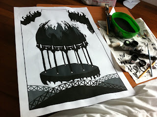
We were given the task to present a silhouette art; either comic or a scene from a movie that Mr Charles wanted us to watch. I chose to make a silhouette based from a scene from Silent Hill Revelation. Before that let me get started on what makes silhouette art so interesting.

Key point here: minimal. Silhouette art doesn't have to be too detail. Just imagine it to be shadow but the edges are refined. Of course what makes the art so special is also the colour; black over white. This could also relate to the Gestalt Principle: Figure Ground.

Silhouette goes way back. In countries such as Indonesia and Indonesia,Wayang Kulit is a form of a silhouette that can be counted as a performance. It plays around as a shadow puppetry. Shadow Puppetry originated during the Han Dynasty.

I came across Lotte Reiniger's Hansel&Gretel Silhouette animation video and was astounded by it Such a work of art. Lotte was inspired by the Chinese art of silhouette puppetry.


Silhouette for me is somehow a story telling you're telling to the public. Though simple, the message is there. Like they say, a picture says a thousand words. I could say the same thing to silhouettes.

The scene you're gonna look down there was inspired during the last fighting scene between the characters. This is my own interpretation. Instead doing a comic style or a view, I decided to make a poster of it. The grown-up Heather is fighting her young self who was once trapped in Silent Hill. I put those grills to make it seems like a barrier from 'the other world'. The fire element I've drawn there is to depict the mood and how it's eating the place up.


Sunday, 18 November 2012

IMPORTANT NOTICE

I am on a medical leave so hehe, some of the works I have not post yet. (Btw, my comic skit is on hiatus until further notice since well, we've been doing other assignments and we kept delaying the comic session) (I told you so)

But, as you can see, I've update quite a number of post while I'm still unwell (well 3 ish is a lot right?) (played around with the dates) The only thing I'm worried about is the paper cutting and the omgosh tessellation.

Without further ado, I will stay in my bed and rest for the day, thank you.

SEE MY COMMITMENT MAN.
SEE IT. EMBRACE IT~
lol.

OH HELL NO.
/faints.

Wednesday, 14 November 2012

UNMASKING

 
Well there you go, how was it? It took a lot of pain and effort to do this video, not to mention the editing. The location was lol, stranded love it but damn those mosquito bites are worth I guess since Vanessa said we got an A! WEE! From 10am until 5pm we ended the first day and I couldn't remember the second day hahaha. But it was really fun, since this like a group of these many people is a first for a video project. Well since great minds think alike we came up with this piece of work!

BEHIND THE SCENES


Tuesday, 13 November 2012

GESTALT GROUP VID

The hard work for editing and creating this video is finally up! 

Saturday, 10 November 2012

SILENT HILL REVIEW

http://25.media.tumblr.com/ca93f149122016ab2c85bd39163a1912/tumblr_mezgbuv14l1rhwdhpo2_500.jpg
 POSTER 
 
So during out of nowhere, we were given a task that requires us to watch a movie. There were some choices from Frankenwinnie, Skyfall but we ended up with Silent Hill (there were some that went to Skyfall but oh well hehe) Okay so were are asked to do a review based from it and we can choose to do our silhouette from this movie or just do our own imagination.

Here it goes, Silent Hill. First impression, I did not expect to want to watch this film because it was a sequel and I haven't even watch the first one so I a bit reluctant to watch it. But seeing that I like horror movies so why not right? Poor Frakenwinnie <- First Choice. Anyway, I've done some research, turns out it was based from a Japanese RP game. Mind you, you can't compare them because from my point of view, the original is always the best; the game.

 
Lets start off with the story, it was mm, gruesome in a way? I'm talking about the nurse part and the octopus head part. I remember haha, I'm sorry for name dropping but Adrian trying to cover his eyes for some parts of the scene. Yea it was pretty gross in a cool way. Honestly, my favourite scene was the nurse one, I was like shit shit shit shit they're coming.


Don't forget the Pyramid Head.

The fight scene was awesome, given the main role is a girl, gotta give her props for doing her job. That reminds me, the dungeon scene creeps me out. Each scene has a certain element to it which is awesome, it draws you into the story. The set is also breathtaking; I'm talking about the part when they first entered Silent Hill, how the fogs surrounds the place.

http://25.media.tumblr.com/b16fba8b1802b8691e4117a74fa68aac/tumblr_mezzhgKGLm1qda3too1_500.gif
 From the first movie 
Overall I was impressed, there's not a lot of good horror movie nowadays but this one is not too bad. It's much better than some hollywood horror movies these days. Although it's underrated, give it try, you might like it, I did and I did not expect that :D